New look, same mission
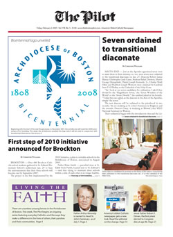
Undoubtedly, you will by now have noticed the new look of America’s oldest Catholic newspaper.
As the archdiocese prepares to celebrate its bicentennial year and after marking our own 175th anniversary, it seemed the perfect time to look to the future.
Plans for a design change were drafted almost six years ago. However, what has come to be called “The Long Lent of 2002,” followed by parish reconfiguration, brought new and sudden challenges into our newsroom. Like many other entities in the archdiocese, those events required us to shift our attention from long-term planning to short-term response. In our case, that meant focusing resources on reporting the ongoing events and bringing Boston Catholics the information they needed to understand a crisis that shook both the spiritual and structural foundations of our archdiocese.
Those challenges, while not completely behind us, no longer demand the attention they once did.
For the last several months the entire Pilot staff has given extensive consideration to how the look, feel and content of the newspaper could be improved. The result is now before you.
We are pleased to say that in the new design we have retained all the features readers have come to expect in The Pilot -- and more. Beginning this week, we will be adding new content, such as profiles of everyday Catholics making a difference in our archdiocese and articles that will inspire readers to better know and practice their faith.
In addition, we are adding commentary from new voices that will help bring readers the Catholic perspective on a myriad of moral and social issues which directly impact Catholics.
However, newspapers are not only about words, but also about images and graphics. To that end, we are doubling the number of color pages in each issue and The Pilot will now be printed on a whiter paper that will allow photos and graphics to be reproduced more faithfully.
Fonts are a crucial component of the newspaper design and layout. We are replacing the main news font, from a heavy-look Palatino type to a more modern-styled Garamond face. The font you are reading allows for improved readability while retaining a light, fluid look.
After much internal debate, a decision was reached not to alter the nameplate of the paper (the way “The Pilot” is displayed on the front page). By keeping the nameplate in a style similar to that which it has had for over 150 years while, at the same time updating the look of the front page we hope to convey both modernity and tradition, two very important elements of The Pilot.
With this redesign, and with the recent revamping of our internet Web site www.TheBostonPilot.com, we stand ready to face the challenges of the future.
It is a happy coincidence that the unveiling of the archdiocese’s bicentennial logo coincides with the first issue of our new look. With the Church in Boston we celebrate and give thanks for our history, and continue to strive to be heralds of the Good News of Jesus Christ in the 21st century.
